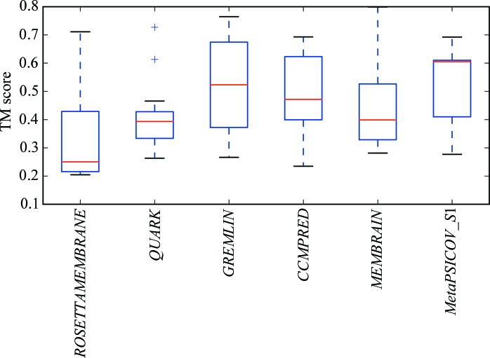
Figure 7.
Boxplot of the distribution of TM scores of the models from the top cluster for all targets across each type of modelling run. For each distribution, the red line indicates the median value, the upper and lower edges of the blue rectangle indicate the first and third quartile values, respectively, and the the black horizontal lines represent the minimum and maximum values with the exception of outliers, which are shown as crosses.

