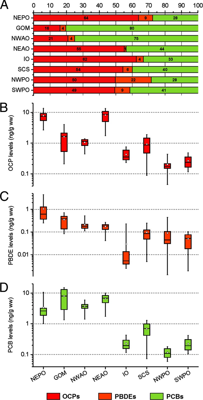
Figure 3.
Geographic distributions and relative contributions of pollutant classes (OCPs, PBDEs, and PCBs) to total POP levels. Percentage contribution of OCPs, PBDEs, and PCBs to the total POP level (A) and ranges of concentrations of the 29 OCPs (B), 9 PBDEs (C), and 209 PCBs (D) in ng/g wet weight for tuna from eight sampling sites. Whiskers represent minimum and maximum values for each site. Diamonds represent the mean values. The horizontal line represents the 50th percentile, and the box represents the 25th and 75th percentiles.

