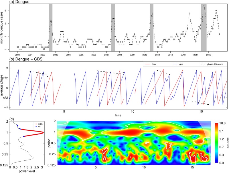
Fig 5. Wavelet coherence and phase plots of dengue and GBS data from 2000-15 in Hong Kong.
Panel (a) is dengue time series with peaks shaded in grey. Panel (b) are phase plots of dengue and GBS. Data are shown in red and blue, and the black dashed line shows phase difference. Panel (c) shows cross wavelet average power level and wavelet coherence plots of dengue and GBS, which shares the same plot code as Fig 4. The horizontal axis labels of 5, 10 and 15 represent year 2005, 2010 and 2015.

