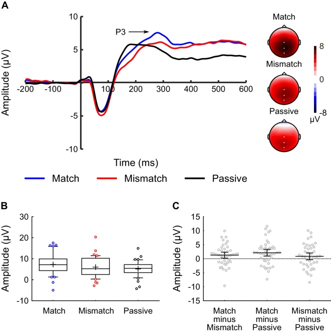
Figure 4. Inner speech experiment: P3 component analysis.
(A) Waveforms showing the auditory-evoked potentials elicited by the audible phonemes in the Match condition (blue line), Mismatch condition (red line), and Passive condition (black line). The P3-component is labelled; P3 amplitude was calculated as the average voltage in the 250–310 ms time-window. The waveforms were averaged across electrodes CPz, Cz, and Pz, as these were the electrodes at which the P3 component was maximal. Voltage maps are plotted separately for each condition; white dots illustrate the electrodes used in the analysis. (B) Box-and-whiskers plots showing the amplitude of the P3 component elicited by the audible phonemes in the Match, Mismatch, and Passive conditions. The edges of the boxes represent the top and bottom quartiles, the horizontal stripe represents the median, the cross represents the mean, the whiskers represent the 9th and 91st percentiles, and the colored dots represent the participants whose raw data fell outside the range defined by the whiskers. (C) Scatterplots showing the within-subjects difference scores (in terms of P3-amplitude) for the three contrasts-of-interest in the inner speech experiment; namely Match minus Mismatch, Match minus Passive, and Mismatch minus Passive. These difference scores were approximately normally distributed with no clear outliers. Each dot represents a single participant’s difference score. The horizontal bars represent the mean, and the error bars represent the 95% confidence interval.

