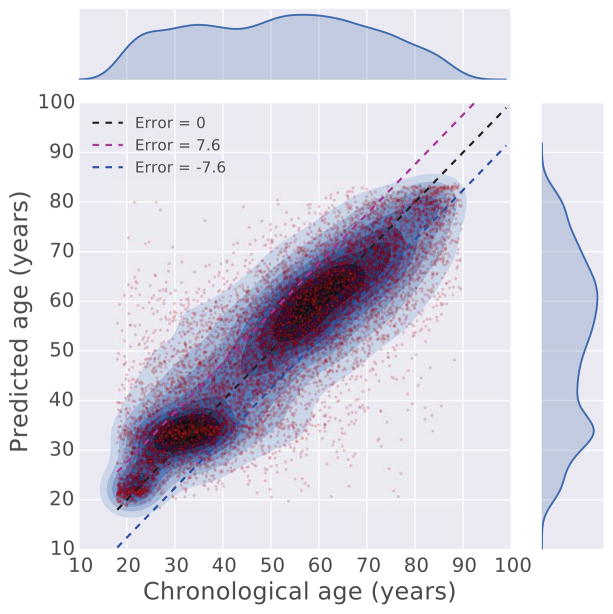
Figure 4. Comparison between chronological age and predicted age.
The chronological age and predicted age of 10,000 randomly sampled patients are plotted against each other in a scatter plot. To show the densities of the data points, kernel density estimation (KDE) is applied to overlay contours on top of the scatter plot. The figure also visualizes the outliers where there is a large discrepancy between the predicted and chronological age. The age range of patients used to produce these figures is 18 to 100 years.

