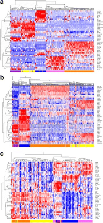
Fig. 2.

Hierarchical clustering analysis of 44-gene expression data in the training set and test sets. a Hierarchical clustering of 295 samples from the training set. Normalized gene expression intensities were shifted to mean = 0, and rescaled to STD = 1 to enhance the expression differences. The average linkage hierarchical clustering method was performed where the metric of similarity was Pearson’s correlation between every pair of samples. The right panel indicates the official symbol of 44 genes. The left panel shows a dendrogram of hierarchical clustering of these genes. Colored pixels capture the magnitude of the expression for any gene, where shades of red and blue represent over-expression and under-expression, respectively, relative to the mean for each gene. The upper panel shows a dendrogram of hierarchical clustering of samples. The histological type of each sample is indicated in the bottom panel, with chromophobe tumours shown in purple, clear cell tumours shown in orange, oncocytoma samples indicated in yellow, papillary tumours in pink, and adjacent tissue samples in blue. The samples clustered into five groups that closely follow the histological types. Among the four tumour subtypes, the oncocytoma and chromophobe samples cluster together, whereas the conventional tumours show a higher degree of similarity to papillary tumours. b Hierarchical clustering of 1020 samples from the Test Set 1. c Hierarchical clustering of 129 samples from the Test Set 2
