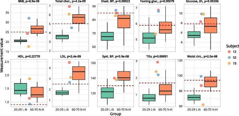
Fig. 2.

Boxplots for the two reference groups “optimal phenotypic flexibility” (green) and “reduced phenotypic flexibility” (red) as well as the values of the three outlier subjects (subjects 12, 52, and 73 shown in a red, blue, and yellow circle, respectively). Box shows the 25 to 75% interquartile range; whiskers indicate the maximum and minimum non-outlier values. Crossbar indicates the median values. Horizontal dotted line indicates cut-off values; levels above this line indicate abnormal clinical values. In waist, the lower dotted line represents cut-off values for female and the upper dotted line represents cut-off values for male; p indicates statistical significance after t test
