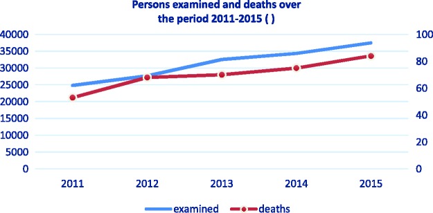
Figure 1.
Comparison between the persons examined and the deaths in the Emergency Department for the period 2011–2015. The chart shows clearly that the annual increase in the number of examinations correlate with the number of deaths. The two lines – of those examined and those who died are almost identical.

