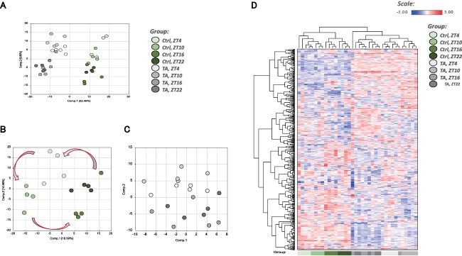
Figure 2.

Overview of metabolome analysis. (A) PCA of normalized metabolic data obtained from the liver at ZT4, ZT10, ZT16, and ZT22. Percentage values indicated on the axes represent the contribution rate of PC1 and PC2 to the total amount of variation. Identical ZTs are encircled by dotted lines of the same color. (B) PCA showing only the controls from (A). (C) PCA showing only the TA group from (A). In computing PC1 and PC2 for the TA group, we used the same formulae obtained using metabolite data from the control group. (D) Heat map of the hierarchical cluster analysis. Columns show the liver metabolome profiles at ZT4, ZT10, ZT16, and ZT22. Rows show normalized levels of each metabolite. The dendrogram for each heat map shows the relatedness of the normalized metabolite level patterns. Abbreviation: Ctrl, control.
