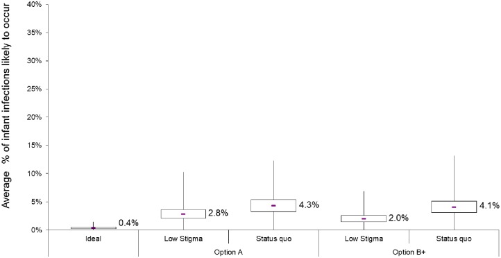
Fig 7. Results from the uncertainty analysis for Option A (red) and Option B+ (blue) scenarios and the idealised (green) scenario.
The box plots show variation in the cohort-median mother-to-child transmission rates over 10,000 simulated cohorts. For each scenario, the box denotes the interquartile range (IQR: 25th to 75th percentiles) and the middle line denotes the median (50th percentile). Whiskers capture values up to twice the width of the IQR, while those exceeding this are shown as outliers (blue scattered tail).

