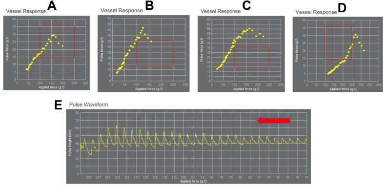
Figure 3. Exemplary demonstration of the range of the applied pressure and the corresponding vessels response.
Each yellow dot is the value of pulse height vs. applied pressure. The yellow dots make a typical shape of vessel response for each patient. Sharp end or arrow shape (like a triangle) may occur in healthy elastic vessel (A, B and D), but smooth and flat curved end similar to a half-arc shape may result due to stiff and tensed vessel (C). The applied pressure differs in each patient according to the vessel’s response to the applied pressure. (A–D) demonstrate the detection of the maximum pulse height at different applied pressure for each person (in A maximum pulse height is reached when applying 150 g f/cm2, in B when applying 150 g f/cm2, in C maximum reach when applying 125 g f/cm2, in D when applying 260 g f/cm2). (E) shows fully measured pulse data with stable baseline. The red rectangle shows the average range of applied pressure and the corresponding pulse pressure changes in healthy people. The red arrow indicates the increase of applied pressure (from right to left).

