Figure 6.

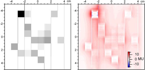
(Color) The figure on the left shows a desired distribution that was reconstructed from the DynaLog File data. The figure on the right shows the difference between an a‐Si imager measurement and the desired distribution.

(Color) The figure on the left shows a desired distribution that was reconstructed from the DynaLog File data. The figure on the right shows the difference between an a‐Si imager measurement and the desired distribution.