Figure 2.
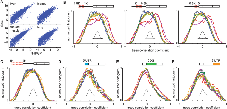
High correlations between promoter region evolution and brain expression. (A) High correlation between NHPRTR and GTEx expression data. Scatter plot comparing between quantile normalized expression values for the same human tissue for liver, kidney, skeletal muscle and lung, from the NHPRTR database (X axis; log2 transformed) and the GTEx database (Y axis; log2 transformed). Pearson correlation r > 0.987 in all four comparisons. (B) Transcriptome tissue color codes are shown in Fig. 1B. Correlation coefficient distributions for three consecutive 500 bp windows in the promoter region show significant shifts towards high values in cerebellum and frontal cortex. Kolmogorov Smirnov P of individual distributions versus the bootstrap distributions (shown as inset) = 2*10–4, P = 4*10–7 and P = 6*10–6 for left, middle and right windows, correspondingly, for frontal cortex and P = 3*10–3, P = 3*10–6 and P = 5*10–6 for left, middle and right windows, correspondingly, for cerebellum. P > 0.05 for or all other comparisons. (C) Transcriptome tissue color codes are shown in Fig. 1B. Correlation coefficient distributions for 3 Kbp to 1.5 Kbp upstream of transcription start site did not show any shift compared with the bootstrap distribution. P > 0.05 for all comparisons. (D-F) Transcriptome tissue color codes are shown in Fig. 1B. Correlation coefficient distributions for 5′UTR (D), CDS (E) and 3′UTR (F) did not show any shift compared with the bootstrap distribution. P > 0.05 for all comparisons. P values are Bonferroni corrected.

