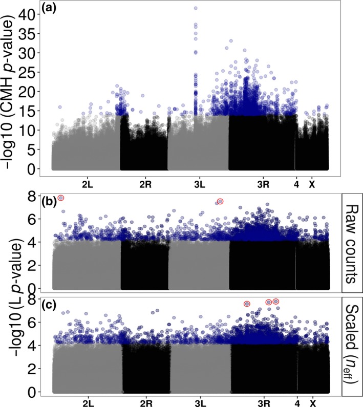
Figure 3.

(a) Manhattan plot of the original CMH‐test results from Orozco‐terWengel et al. (2012a,2012b). Blue points are the top 2,000 SNPs identified by the CMH‐test. Also shown are manhattan plots of the re‐analysis of the Orozco‐terWengel et al. (2012a,2012b) data using Quasibinomial GLMs on (b) the raw counts as well as (c) scaling counts to neff. Shown are the −log10 (p‐values) from the main treatment line (L) effect. Blue points are the top 2,000 SNPs. Red points in (b) and (c) are SNPs that pass genome‐wide Bonferroni correction. Note the differences in scale on the y‐axis across the panels
