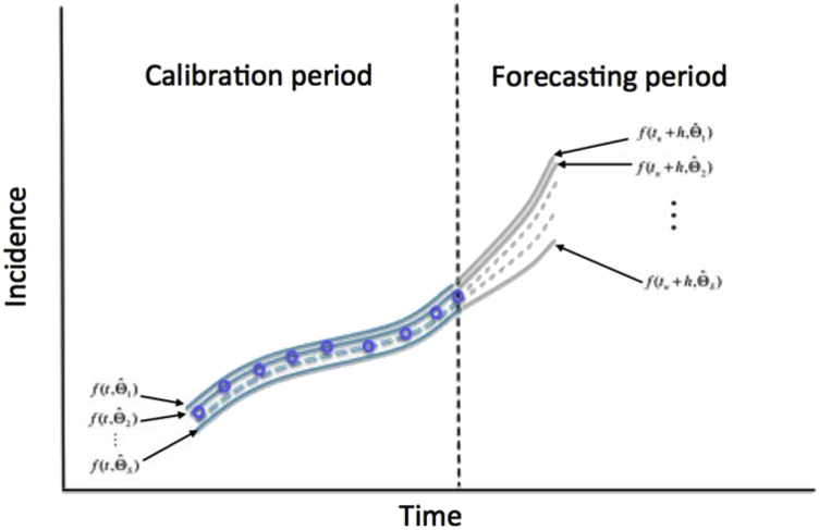
Fig. 12.
Schematic diagram shows the uncertainty around the model fit (blue lines; calibration period) given by and the corresponding uncertainty in the forecast for a time horizon of time units (gray lines; forecasting period) given by . The blue circles denote the time series data. The vertical dashed line separates the calibration and forecasting periods.

