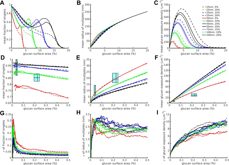
Fig 3. The edge biased unmasking model improves correspondence of simulated and experimental datasets.
We show Pedge = 4% bias runs as an example. (A-C) Full results over the entire simulation for various combinations of stripe width and glucan coverage for the three simulation and experimental outputs measured. (D-F) Similar to A-C, but showing zoomed in results corresponding to the experimental data domain. The cyan range boxes express ranges in the style of box plots with the lines representing the 25th, 50th and 75th percentiles of the experimental data, going from left to right or bottom to top, on the corresponding axes. Within each plot, the left-most cyan range box corresponds to untreated yeast, the right-most to caspofungin-treated yeast. (G-I) The standard deviations of the zoomed in results from D-F. The lines represent mean (A-F) or standard deviation (G-I) values calculated from n = 100 runs for each condition.

