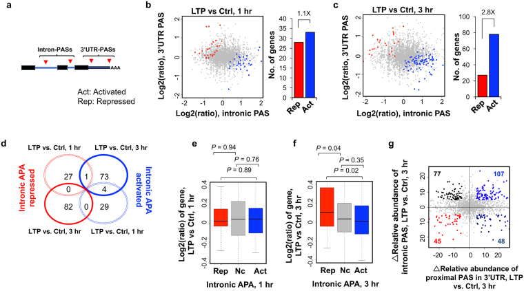
Figure 4.
Regulation of intronic APA after LTP induction. (a) Schematic of intronic APA analysis. Intronic PASs were compared with 3′UTR-PASs. (b) and (c) Left, scatterplot comparing expression change (LTP vs. control) of intronic PASs (x-axis) and 3′UTR PASs (y-axis). Genes with significantly activated intronic PAS usage are shown in blue (Act) and those with significantly repressed intronic PAS usage in red (Rep) (p < 0.05, DEXSeq and relative abundance change >5%). Grey dots represent genes without significant regulation (Nc). Right, bar graph showing the number of genes with activated or repressed intronic APA. (d) Venn diagram comparing genes with CDS-APA regulation at 1 hr post LTP and 3 hr post LTP. Genes correspond to those in (b) and (c). (e) and (f), Box plot showing the log2ratio (LTP/Ctrl) of genes with intronic PAS activation or intronic PAS repression, 1 hr (e) or 3 hr (f) post LTP induction. Genes with significant intronic APA regulation are those from (b) or (c). P-values (Wilcoxon rank sum test) indicate the difference between groups. (g) Scatterplot comparing 3′UTR APA regulation (x-axis) and intronic APA regulation (y-axis) at 3 hr post LTP induction. Δ relative abundance for 3′UTR APA is based on the two 3′UTR PASs with most reads, as in Fig. 2, and Δ relative abundance for intronic APA is based on all intronic PAS reads vs. all 3′UTR PAS reads. Genes with intronic APA and/or 3′UTR APA change (>5% relative abundance) are highlighted with different colors based on the type of change.

