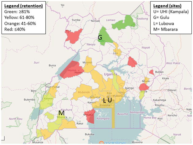
Figure 4. Heat map of retention by district.

Color coding represents the proportion of patients retained in care. Only districts reporting at least five patients alive at the end of the study were included in this analysis. For reference, the locations of the clinic sites are shown.
