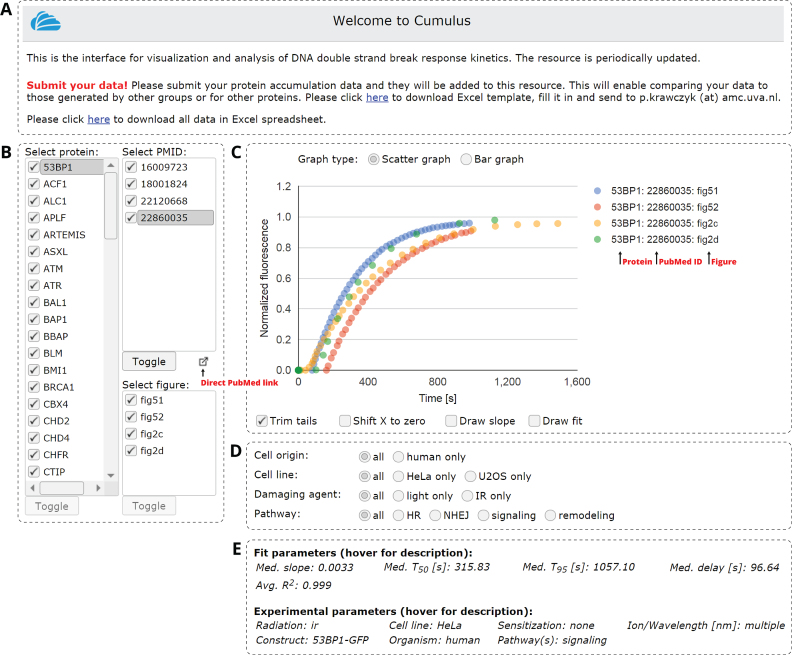
Figure 2.
Overview of the interactive web interface for visualization and analysis of accumulation. (A) Data upload/download panel. (B) List of all analyzed proteins, of all studies that analyzed each protein (identified by their Pubmed ID) and of all datasets (figures) in each study from where accumulation data were extracted. (C) Data visualization panel. The normalized data can be be visualized either directly or as a bar graph showing a number of parameters (t50, t95, slope) for each protein. (D) The data can be filtered using the indicated parameters. (E) Panel displaying various parameters of the selected protein/study/dataset and of the exponential fit.

