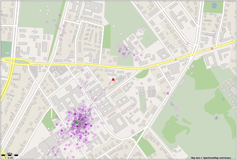
Fig 6. Detected dances mapped back to the field.
The average duration and orientation of four or more waggle runs per dance were translated to a field coordinate. The spots’ color saturation denotes the number of waggle runs in the dance, white corresponding to the dances with four waggle runs and deep purple to the those with the maximum number (17 for this particular data set). A linear mapping was used to convert waggle duration to distance from the hive. The hive and feeder positions are depicted with a red and green triangle, respectively. The dashed line represents the average direction of all dances (Map data copyrighted OpenStreetMap contributors and available from https://www.openstreetmap.org [49]).

