Figure 5.
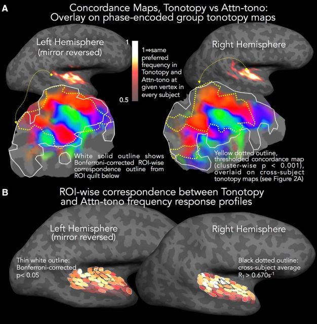
Comparison of tonotopy and attn-tono maps. A, Concordance maps are rendered in heatscale on the inflated hemispheres to illustrate the similarity in best frequency between tonotopic and attn-tono maps (the latter averaged over stepped and randomized blocks). These maps were calculated in two stages. First, in each subject's native EPI space, a voxel was coded as 1 if tonotopy and attn-tono stimuli evoked the same best frequency, and otherwise coded as 0. Second, for each subject, the concordance maps were resampled to the individual's cortical surface and projected onto the unit icosahedron for cross-subject surface-based averaging, thereby creating a composite measure of agreement between tonotopy and attn-tono maps, weighted by the consistency of this agreement across subjects. The concordance maps are statistically masked with a cross-subject t map, calculated versus chance agreement (p = 0.20) with a surface cluster correction of p < 0.001 (vertexwise p < 0.01, cluster threshold surface area >74 mm2) (Hagler et al., 2006). To demonstrate the extent of tonotopically mapped cortex that is similarly mapped through spectrally directed attention, the phase-encoded tonotopy cortical patches from Fig. 2A are overlaid with the outline of the thresholded concordance map shown by the yellow dotted line. White solid outline indicates the Bonferroni-corrected ROI-wise correspondence outline from the ROI quilt in B. B, Shading in each small ROI patch represents the z score for the partial fit between tonotopy and attn-tono responses to each frequency band (with subjects as a random factor). Thin white outline indicates ROIs with significant z scores (Bonferroni-corrected p value threshold of p < 0.05).

