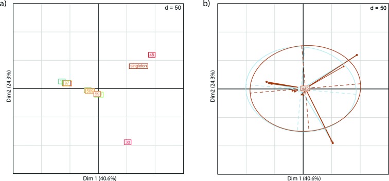
Fig. 2.
Principal Component Analysis (PCA) plots showing the relatedness of the 241 isolates. PCA plots were made with the dudi.pca function in R retaining 2 axes. (a) PCA of all 241 samples, showing the two first principal components, samples are coloured by CC type. (b) The same PCA plot as in (a), but coloured by infection type. Taken together this shows that the strongest signal in the data derives from the CCs with dense clusters and not the infection type. Associated eigenvalue plots are shown in Fig. S6.

