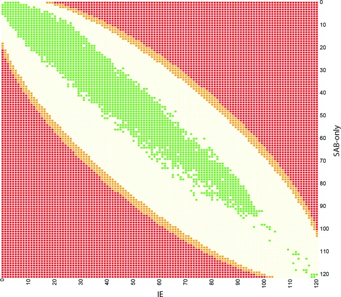
Fig. 3.
SNP distribution compared to significance level. The colour of the square corresponds to significance level (as in Fig. S1). Red squares correspond to a P-value <0.05 after multiple testing correction, orange squares correspond to P-values >0.05 and <1 after correction, light yellow squares correspond to P-values=1 after multiple testing correction. All 120 850 SNPs from our dataset are marked in green. This illustrates that no SNPs in this project are significantly associated to either IE or SAB-only isolates, based on Fisher tests, and a significance level of 0.05 after multiple testing correction.

