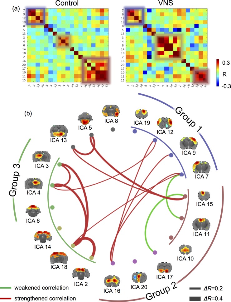
Fig 4. VNS altered the functional connectivity among functional networks.
(A) shows the correlations between independent components. The left shows the correlation matrix during the resting state (or the “control” condition). The right shows the correlation matrix during VNS (or the “VNS” condition). Smaller squares highlight the networks (or ICs) that were clustered into groups (based on k-means clustering). (B) shows the IC-IC functional connectivity that was significantly different between the VNS and control conditions (t-test, P<0.005). Red lines represent increases in functional connectivity, and green lines represent decreases in functional connectivity. The thickness of the lines represents the (VNS minus control) change in correlation. The brain maps show the spatial patterns of individual ICs. Corresponding to the squares in (A), the arc lines illustrate how the ICs were clusters into groups, for the VNS condition (inner circle) and the control condition (outer circle).

