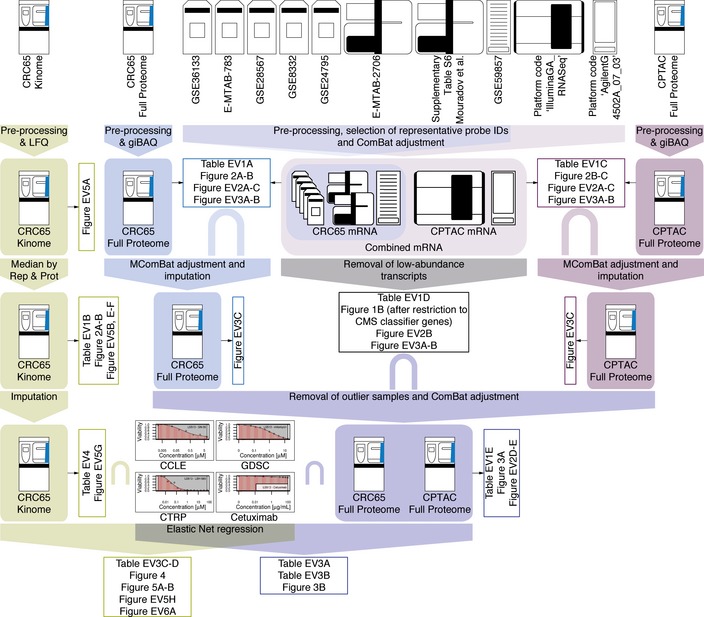
Figure EV1. Data integration pipeline (related to Fig 1).

Overview of the data integration pipeline. Raw data (no box) at the top were subjected to different processing steps (filled box‐arrows), which resulted in processed datasets (filled boxes). These were in turn used to generate figures and tables (open boxes). The intersect symbol “∩” was used to denote datasets, which were integrated based on their intersection. The different proteomic datasets were colour‐coded as in the main manuscript (green = Kinobeads, blue = CRC65 full proteomes and purple = CPTAC full proteomes; see main text and Appendix Supplementary Methods for details).
