Fig. 5.

Demographics: polled voters versus Twitter users. The left-hand side (orange) shows the age distribution of the UK eligible voters as estimated by polls. The right-hand side (blue) shows the age distribution of the UK Twitter users

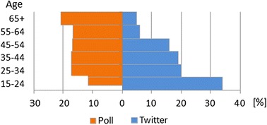
Demographics: polled voters versus Twitter users. The left-hand side (orange) shows the age distribution of the UK eligible voters as estimated by polls. The right-hand side (blue) shows the age distribution of the UK Twitter users