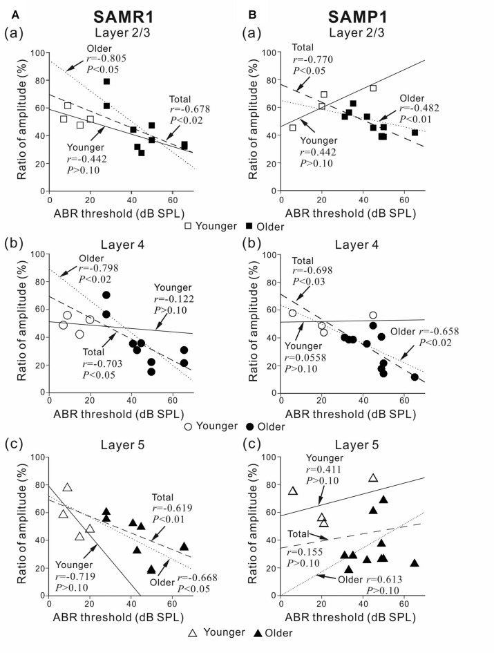
Figure 5.
Plots showing the correlation between the ABR threshold and peak amplitude ratio before and after SS superfusion. (A) For younger and older SAMR1 mice, the correlation plots of L2/3, L4 and L5 are respectively shown in (a–c). (B) Similarly, for younger and older SAMP1 mice, the correlation plots of L2/3, L4 and L5 are respectively shown in (a–c). In each plot, r and p-values are written. Linear regression lines for the younger, older, and total (pooled) groups are plotted by straight, dotted, dashed lines, respectively. Data points for younger and older SAM are illustrated by open (□, ○ and △) and filled (■, ● and ▲) marks in the three layers (L2/3, L4 and L5), respectively.

