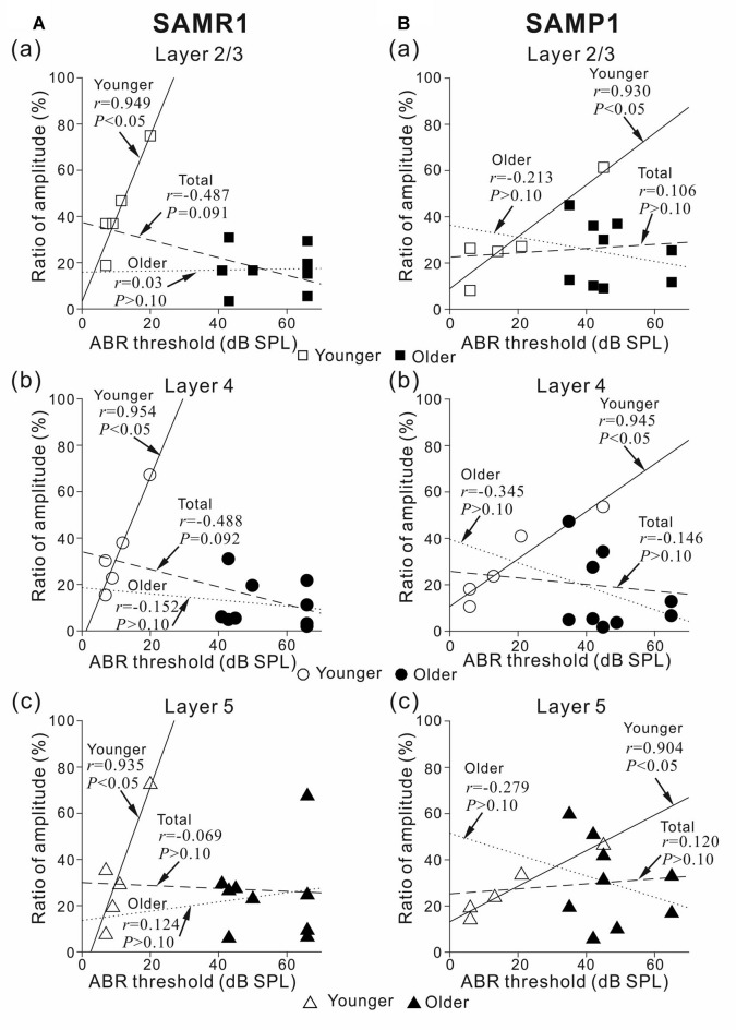
Figure 8.
Plots showing the correlation between ABR threshold and peak amplitude ratio before and after the 5-μM MSC superfusion for younger and older SAMR1 and P1 mice. (A) For younger and older SAMR1 mice, the correlation plots of L2/3 (squares), L4 (circles), and L5 (triangles) are respectively shown in (a–c). Data points for younger and older mice are illustrated by open (□, ○ and △) and filled (■, ● and ▲) marks in the three layers, respectively. Linear regression lines for the younger, older, and total (pooled) groups are plotted by straight, dotted, dashed lines, respectively. In each plot, r and p-values are reported. (B) Similarly, for SAMP1 mice, the correlation plots between ABR threshold and peak amplitude ratio for L2/3, L4 and L5 before and after the 5-μM MSC superfusion for younger and older SAMR1 are shown in (a–c), respectively.

