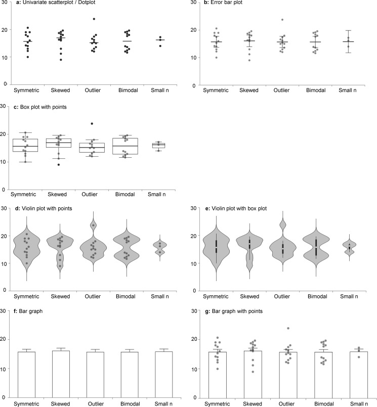
Figure 2.
Different figures emphasize different aspects of the data. This figure shows some examples of graphs that can be created using the interactive dotplot tool and illustrates how different figures emphasize different aspects of the data (see Box 1). a, univariate scatterplot showing group means. b, error bar plot showing the mean and 95% confidence interval, with data points. c, box plot with data points. The center line of the box represents the group median, whereas the top and bottom of the box represent the 75th and 25th percentiles. Whiskers are extended to the most extreme data point that is no more than 1.5 × interquartile range from the edge of the box (Tukey style). Black dots beyond the whiskers represent outliers. d and e, violin plots estimate the data distribution by using a kernel density function. The violin plot includes an adjustable smoothing parameter, which controls how closely the “violin” shape follows the distribution shown by the data points. Data points (d) or a box plot (e) can be added to the center of the violin plot. f and g, bar graph showing mean and S.E., with (g) or without (f) data points. The interactive dotplot tool includes bar graphs for educational purposes; however, they are not recommended for use in scientific publications.

