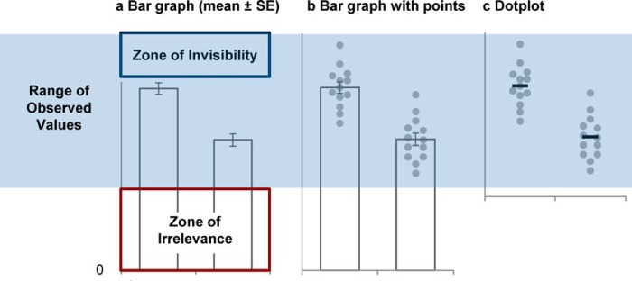
Figure 4.
Anatomy of a bar graph. Bar graphs arbitrarily assign importance to the height of the bar rather than focusing attention on how the difference between means compares to the range of values observed in the sample. a, the bar height represents the mean, and the error bars each represent one S.E. The y axis starts at zero and ends just above the highest error bar. b, adding data points reveals that the y axis scale distorts one's perception of the range of observed values. The bar graph in a includes low values that never occur in the sample (Zone of Irrelevance) and excludes values above the highest error bar that are observed in the sample (Zone of Invisibility). c, the dotplot emphasizes how the difference between means compares with the range of values observed in the sample. The y axis includes all observed values.

