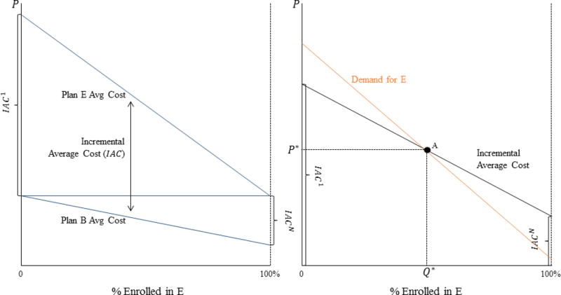
Figure 1. Equilibrium Sorting with Adverse Selection.
Notes: In both panels, enrollment in Plan E is increasing along the x-axis, and the price differential is on the y-axis. The left panel describes the average cost of individuals enrolled in Plan E and Plan B as a function of enrollment in E. The difference between the lines defines the incremental average cost curve shown in the right panel. The right panel illustrates the equilibrium price differential and sorting where the demand curve crosses the incremental average cost curve. The figure illustrates the case where Plan E is adversely selected.

