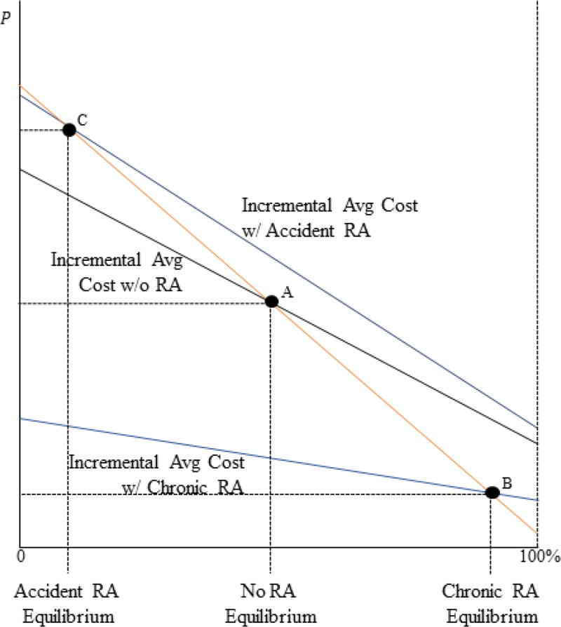
Figure 3. Equilibrium under Various Risk Adjustment Policies.
Notes: In the figure, enrollment is on the x-axis and the price differential is on the y-axis. The figure shows the incremental average cost curve in three settings: no risk adjustment, risk adjustment where adjusted costs equal accident costs, and risk adjustment where adjusted costs equal chronic costs. The equilibrium in each setting occurs where the orange demand curve crosses the incremental average cost curve. The figure illustrates the three equilibria.

