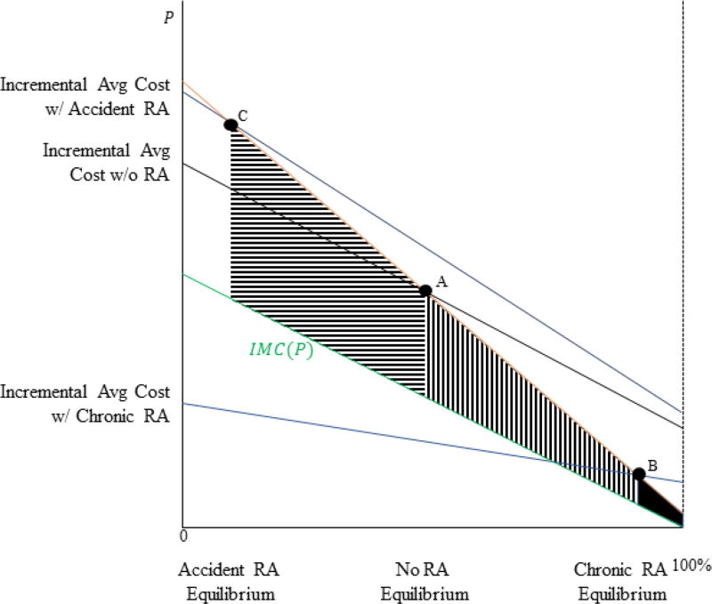
Figure A1. Welfare Loss under Various Risk Adjustment Policies.
Notes: In the figure, enrollment is on the x-axis and the price differential is on the y-axis. The figure shows the incremental average cost curve in three settings: no risk adjustment, risk adjustment where adjusted costs equal accident costs, and risk adjustment where adjusted costs equal chronic costs. The equilibrium in each setting occurs where the orange demand curve crosses the incremental average cost curve. The figure also presents the green incremental marginal cost curve. Welfare loss is represented by the area between the demand curve and the incremental marginal cost curve at the equilibrium enrollment point.

