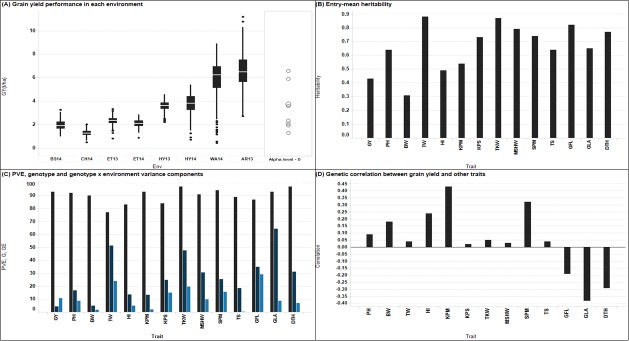
Fig 1.
Visualization of phenotypic performance (A) Individual environment boxplot for grain yield. The y-axis is grain yield in t ha1 and the x-axis represents environments. The mid line in the box represent the median, the lower and upper horizontal lines of the box represent 25 and 75 percentiles, respectively. The lower whisker represents the 25th percentile minus 1.5 × inter-quartile range (IQR) and the upper whisker is the 75th percentile plus 1.5 × IQR. (B) Entry-mean heritability (C) Percentage of phenotypic variance explained (PVE), genotype and genotype x environment components (D) Genetic correlation between grain yield and agronomic traits.

