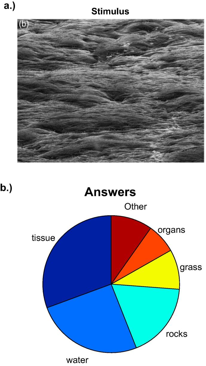
Fig. 7.
Inverted Waves. Panel a shows the inverted waves image from Häkkinen and Gröhn (2016). The pie chart in panel b illustrates relative frequencies of responses. Note that relative frequencies were high for all response options indicating the lack of agreement across observers. Turn the image in panel a upside-down to see the original upright photo in which everybody sees waves without any ambiguity.

