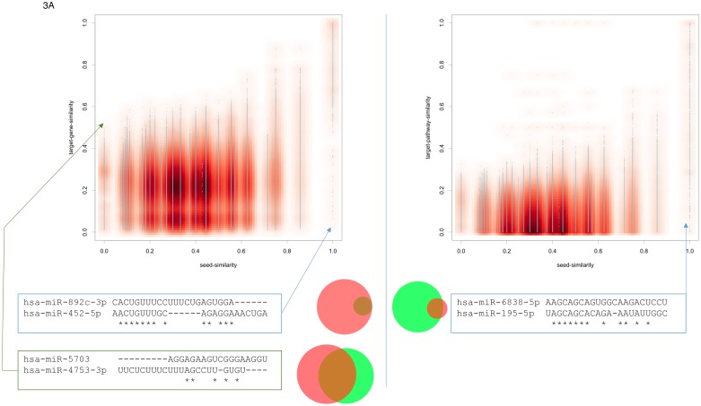
Figure 3.
(A) Scatter plots for the seed similarity compared to the target gene set similarity (left part) and the target pathway set similarity (right part). Again, extreme cases not following the expected pattern are highlighted. The area proportional Venn diagrams highlight the overlap in the gene set and the pathway set for the respective examples.

