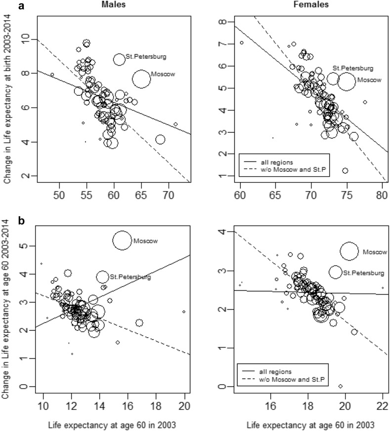
Fig. 3.
Correlation between the regional levels in life expectancy at birth (a—upper panel) and at age 60 (b—lower panel) in 2003 and the corresponding changes between 2003 and 2014, by sex (in years). Note: The trend line is estimated by weighted OLS regression; the circle size indicates the population in each region in the year 2003.
Source: Own calculation based on data provided by Rosstat

