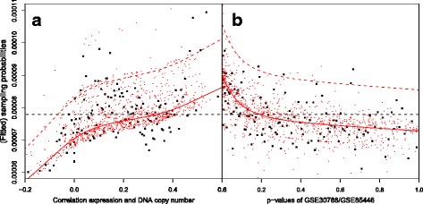
Fig. 2.

Fit of the co-data model for the LNM example. Each square represents 100 genes grouped by either (a) DNA copy number-expression correlation or (b) p-value. The red lines represent the marginal fit across the correlations or p-values. The top red lines represent the fit for genes present in the gene profile. The cloud of red dots represent the fitted values for 1000 randomly selected genes
