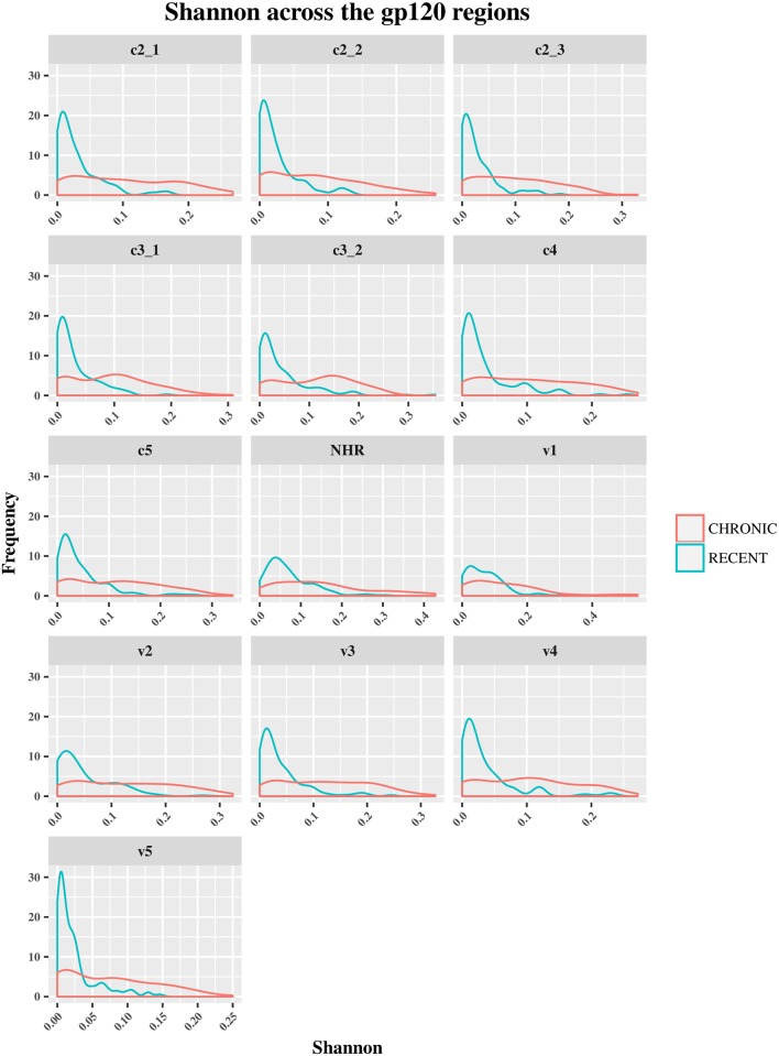
Fig 6. Frequency polygons (ggplot2) of Shannon entropy index of env sequences of recent HIV-1 infected individuals compare to chronically infected ones by env segments.
The Y axis represents the density of observations (frequency) and the X axis the Shannon entropy index distribution as sequence-based diversity measure. The blue color represents plot and distribution for recent HIV-1 infected population and the red color plot and distribution for chronic infected ones.

