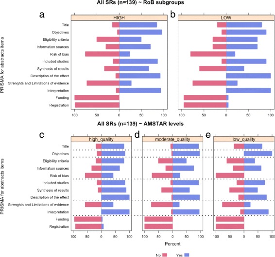
Fig. 3.

Frequency distributions of responses to reporting assessment using PRISMA for Abstracts comparing SR based on methodological quality and risk of bias. This panel of plots contains different graphs showing PRISMA for Abstracts results when reviews are subgrouped by ROBIS (a,b) and AMSTAR (d,d,e) classifications. (a-b) These plots display frequency distributions of responses (‘no’, ‘yes’) to PRISMA for Abstracts comparing reviews by risk of bias using ROBIS tool (‘high’ or ‘low’). (c-d) These plots show frequency distributions of PRISMA for Abstracts responses (‘no’ or ‘yes’) comparing reviews by AMSTAR-derived methodological quality levels (‘high’, ‘moderate’, or ‘low’)
