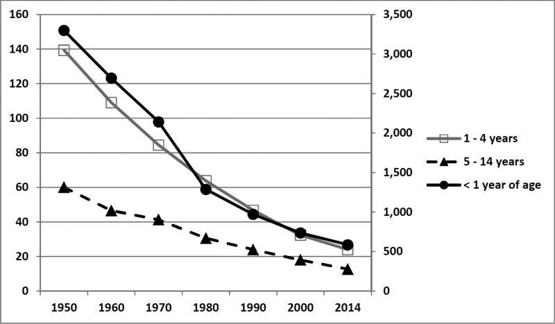
Figure 1. Death rates among three pediatric cohorts for all causes in the United States.
The figure depicts the decreasing mortality rates among three pediatric cohorts from 1950 through 2014. The less than one year of age cohort (solid black circles, solid black line) is plotted on the right-sided secondary axis. The 1 – 4 year old cohort (open squares, gray line) and the 5 – 14 year old cohorts are plotted on the left-sided, primary axis. Mortality rates are expressed in deaths per 100,000 resident population.
Data from National Center for Health Statistics. Health, United States, 2015: With Special Feature on Racial and Ethnic Health Disparities. Hyattsville, MD. 2016. Table 21. Death rates for all causes, by sex, race, Hispanic origin, and age: United States, selected years 1950–2014. Page 113.

