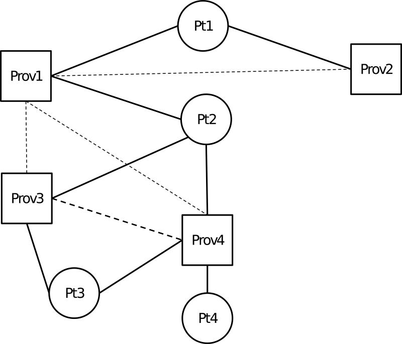
Figure 1. Schematic of network construction.
Squares represent providers (Prov1 – Prov4) and circles represent patients (Pt1 – Pt4). Solid lines represent a patient-provider relationship based on billing for an outpatient visit. Dashed lines represent provider-provider relationships inferred by both providers having billed outpatient care for a pair of patients, with heavier lines (between Prov3 and Prov4) representing more such shared patients. Note, as an example, that for Prov1, provider connectedness is 100%, as s/he is connected to all other providers in the diagram, whereas for Prov4, provider connectedness is 66.67%, as s/he is connected to 2 of 3 other providers. The median provider connectedness for Pt2 is then 66.67%, the median of the provider connectedness for Prov1, Prov3, and Prov4, the providers in Pt2’s constellation.

