Figure A1.
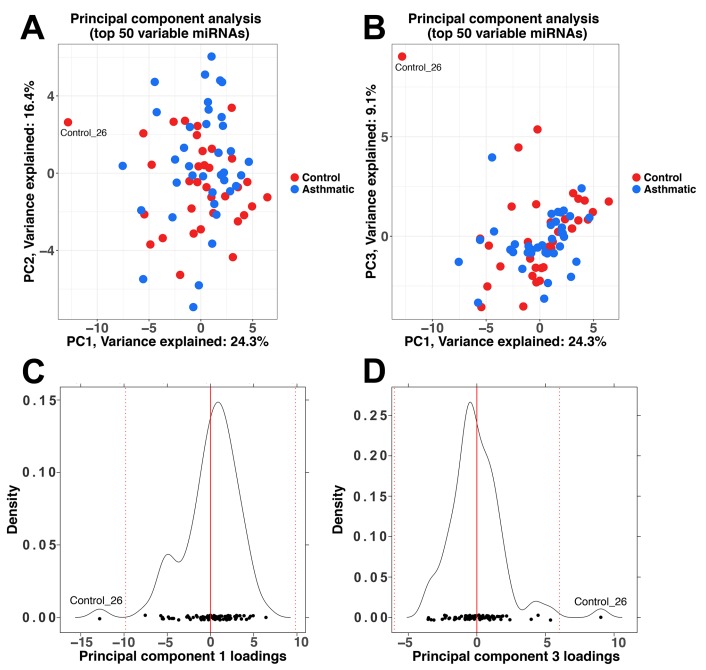
Principal component analysis (PCA) including the 50 most variable miRNAs. (A) PCA plot of principal component (PC) 1 versus PC2; (B) PCA plot of PC1 versus PC3; (C) Density plot of the PC1 loadings. The red line indicates the mean of the values, while the dotted red lines represent the mean value ± three standard deviations; (D) Density plot of the PC3 loadings.

