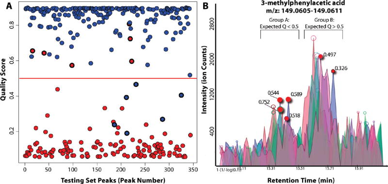
Figure 3.
Effectiveness of automated peak quality scoring. (A) Automated peak quality scores (Y-axis) for peaks manually annotated as high quality (blue) and low quality (red). On a test set of 350 annotated peaks, there were 12 incorrect predictions, with roughly equal number of false positive and false negatives. (B) Incorrect predictions involve peaks of marginal quality. The peaks of group A were classified by an analyst as “low quality”. Those of group B were manually classified to be “high quality”. Incorrect automated predictions, based on a cutoff of 0.5, are highlighted. Each involves a borderline peak that received an intermediate quality score (0.2–0.8).

