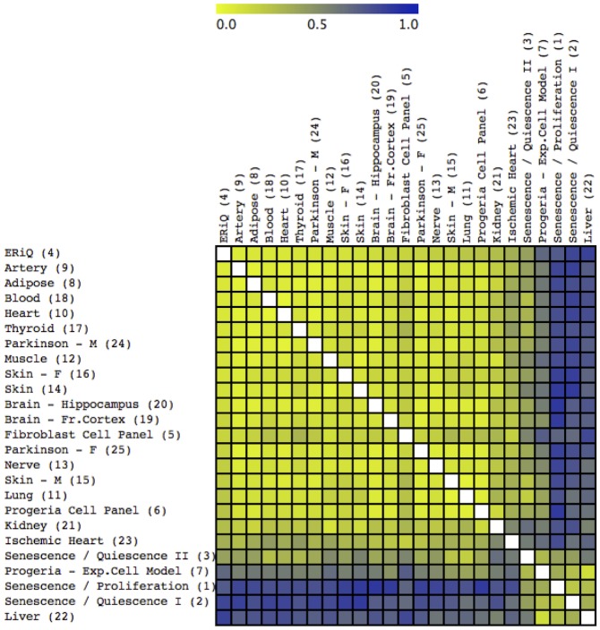
Fig 2. Sample distance map and classification.
The distance map indicates similarities of samples based on ranked transcription factor enrichment scores, using 125 TRANSFAC motifs. Dissimilarity increases from yellow to blue. The distance map is overlaid by a result from K-Means Classification (KMC), discriminating three distinct groups marked by white lines. Most samples included in this study aggregate with an experimental energy restriction model and also include brain samples from Parkinson’s patients. In contrast, tissues including kidney, liver, female skin and ischemic heart aggregate with experimental models of senescence.

