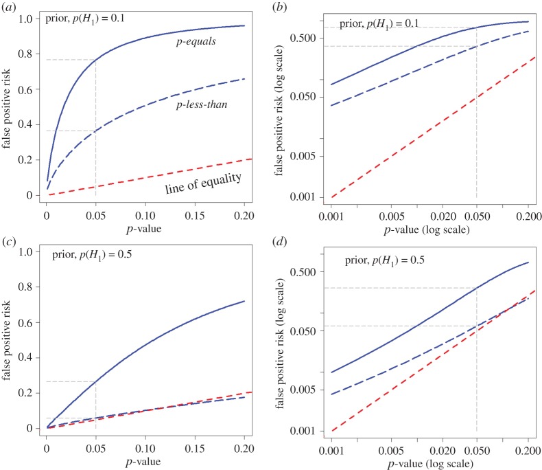
Figure 2.
Plots of false positive risk (FPR) against p-value, for two different ways of calculating FPR. The continuous blue line shows the p-equals interpretation and the dashed blue line shows the p-less-than interpretation. These curves are calculated for a well-powered experiment with a sample size of n = 16. This gives power = 0.78, for p = 0.05 in our example (true effect = 1 s.d.). (a,b) Prior probability of a real effect = 0.1. (c,d) Prior probability of a real effect = 0.5. The dashed red line shows a unit slope: this shows the relationship that would hold if the FPR were the same as the p-value. The graphs in the right-hand column are the same as those in the left-hand column, but in the form of a log–log plot. Graphs produced by Plot-FPR-versus-Pval.R (see the electronic supplementary material).

