
Fig. 5.
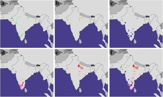
GPS predictions for the five SAS populations from 1000 Genomes Project. A map depicting the GPS predicted locations for (a) PJL (b) GIH (c) ITU (d) STU (e) BEB and (f) merged. The red, blue, orange, green, and pink triangles depict BEB, ITU, GIH, PJL and STU populations, respectively. Maps were plotted using the R package rworldmap v1.3–1 [52]