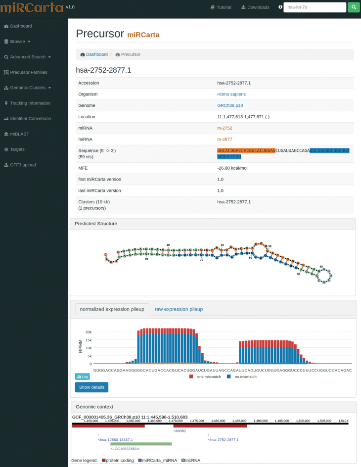
Figure 3.
Example of a precursor view for a predicted candidate in miRCarta. First, we list several basic facts about the precursor like its sequence, location, links to miRNAs, etc. In addition, we visualize the stem loop structure with the FornaContainer plugin (36) and color the miRNAs in the same way as in the sequence of the precursor. Below the structure, we show the pileup plots for the normalized or raw read counts with plotly.js. The user can easily switch here between log and linear scale or even visualize only counts with zero or one mismatches. The button ‘Show details’ opens a new HTML page, where more information can be found on how many samples had reads for this precursor and graphics showing if we found these reads rather continuously in several experiments or only a few. The last part shows the genomic context of the current precursor in a window of ±10 kb. This way it can be easily assessed if there are more precursors in this range or if the precursor lies in a gene or close to a gene for example. The genomic context is also interactive and allows for zooming in and out, and shows more information when clicking on a gene or miRNA etc.

