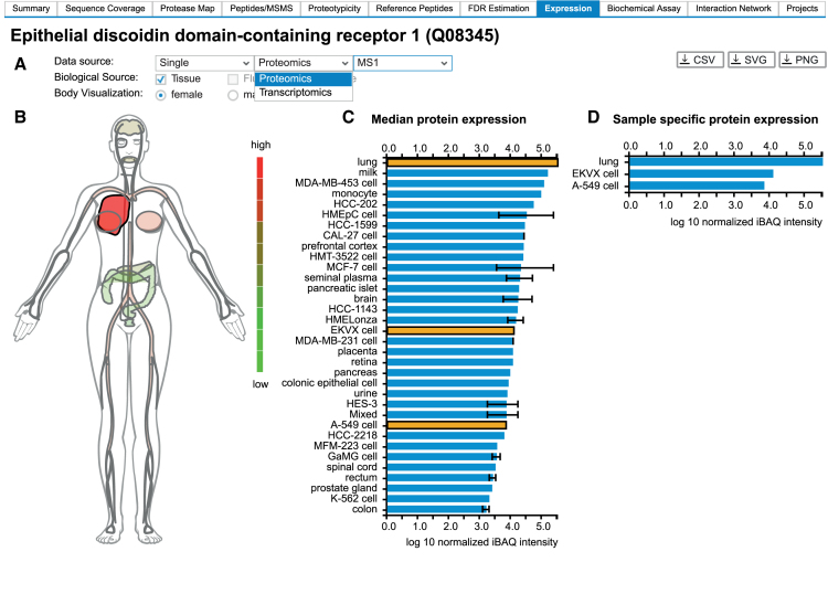
Figure 3.
(A) ProteomicsDB can visualize expression data from different omics technologies. (B) A heatmap-like bodymap superimposing abundance values of tissues, fluids and cell lines (biological sources) onto their respective tissues of origin. (C) A bar chart resolving the expression data of b) on the level of their biological source. If multiple measurements for the same biological source are available, the error bar indicates the lowest and highest abundance observed for the selected protein. The bar chart and the bodymap are linked to each other, enabling the selection of either a tissue of origin in the bodymap (highlighted in dark red) or a biological source in the barchart (highlighted in orange). Here, the lung (high expression of DDR1), was selected in the bodymap, which automatically highlights all corresponding tissues and cell lines in the bar chart (EKVX cell and A-549 cell originated from lung tissue). (D) A bar chart visualizing sample-specific abundance values of the sources selected in middle bar chart (highlighted in orange). On click on one of the bars, the corresponding sample preparation protocol can be examined.

