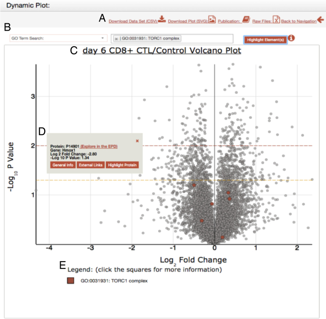
Figure 4.
Example showing the EPD dynamic plot window. (A) The dataset functionality bar: This section allows a user to download either; the plot as a svg file, download the dataset as a csv file, or to access the relevant publication describing the data shown. Finally, a link is also provided to the PRIDE open access data repository that allows a user to download also the original raw MS files. (B) The search bar. The dropdown menu displays the different contextual elements integrated for search: currently either a GO Term, Protein complex, Reactome Pathway or a protein. (C) Example of a dynamic plot, in this case a volcano plot showing protein levels in mouse CD8+ cytotoxic T cells treated with rapamycin. The orange dotted line represents a P-value of 0.05 and the red line represent a P-value of 0.01. The P-values are calculated with a two-tailed t test and a Bonferroni correction. (D) The tooltip that is displayed when a click event is performed over any protein. This provides additional information about the specific element selected on the graph. (E) The legend displays the name(s) of the selected elements on the plot, along with a box demonstrating the color associated with the element.

